Widget content settings
These settings allows you to configure widget's data content and configure tap actions. Available options varies with widget types as detailed below.
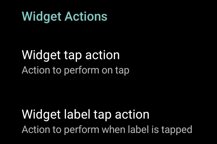
All widgets can configure actions:
- Widget tap action, configure what to do when tapping the widget itself.
- Widget label tap action, configure what to do when tapping the widget label (if visible or hidden, not removed).
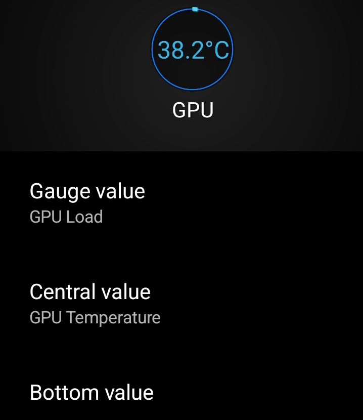
Gauge widget have those simple options:
- Gauge value, select what the gauge will show (as a percentage of actual data).
- Central/top value, select nothing, gauge value or a specific data to show its value in the middle of the gauge.
- Bottom value, select gauge value (nothing) or a specific data to show below the central value (effectively becoming the "top" value).
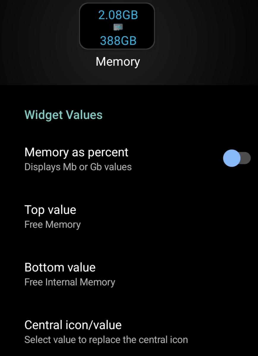
Text (1x1) widgets can show up-to 3 different data with the following options:
- Top value, selects data to show at the top.
- Bottom value, selects data to show at the bottom.
- Central icon/value, select an icon or a third value to show in the middle of the widget.
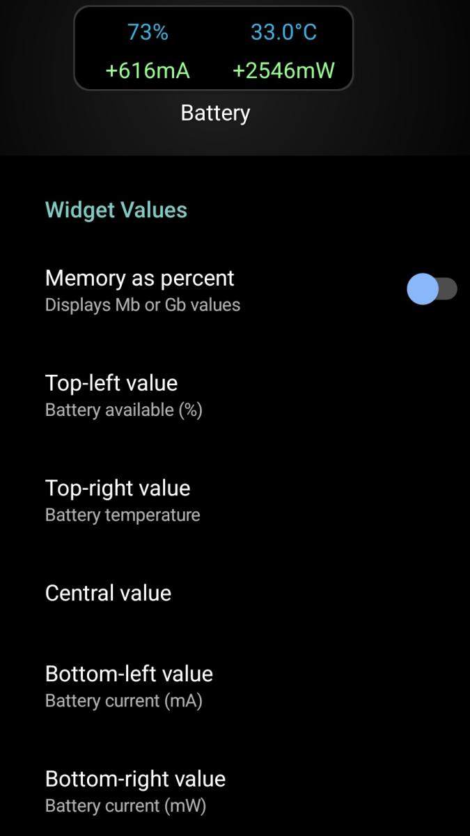
Text (2x1) widget can show up-to 5 different data given the following options:
- Top-left value,
- Top-right value,
- Central value, either nothing or an extra data in the center of the widget
- Bottom-left value,
- Bottom-right value
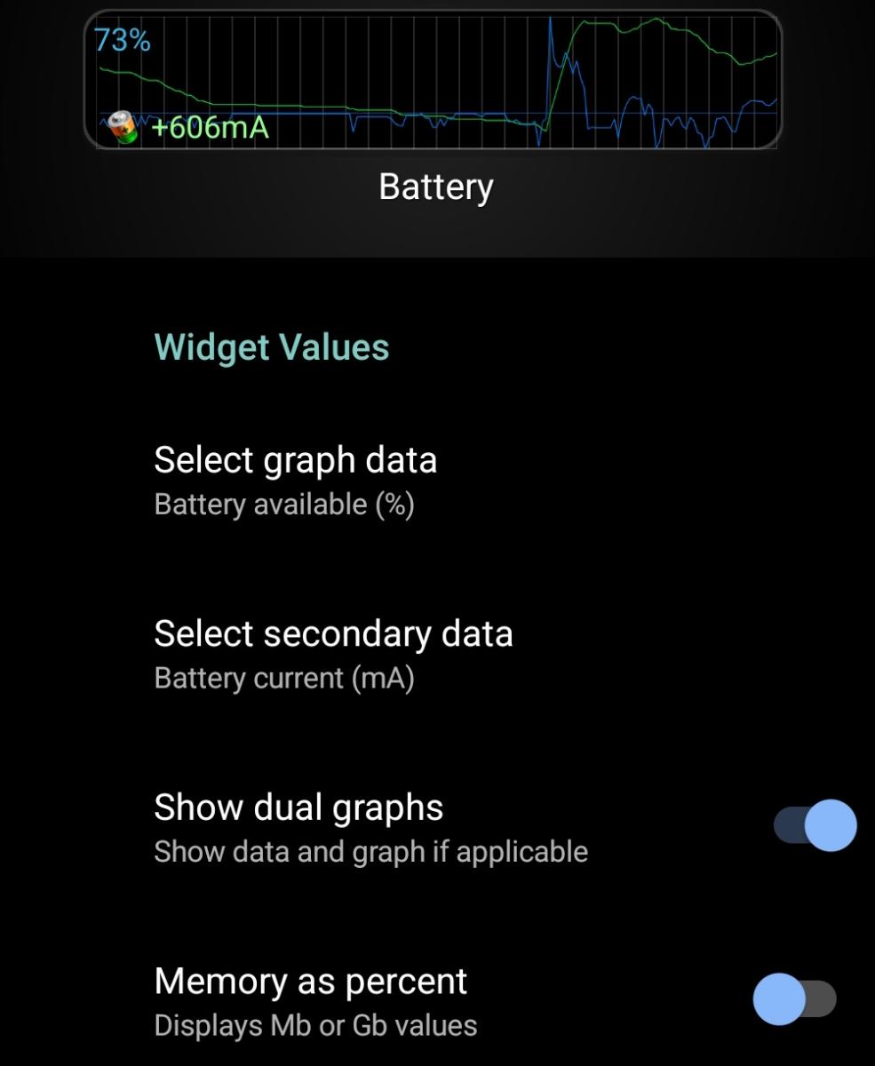
Graphic widgets (any sizes) can show up-to 2 graphics configured as follows:
- Primary graph data,
- Secondary graph data,
- Show dual graphs to enable both graphics or keep only primary one.
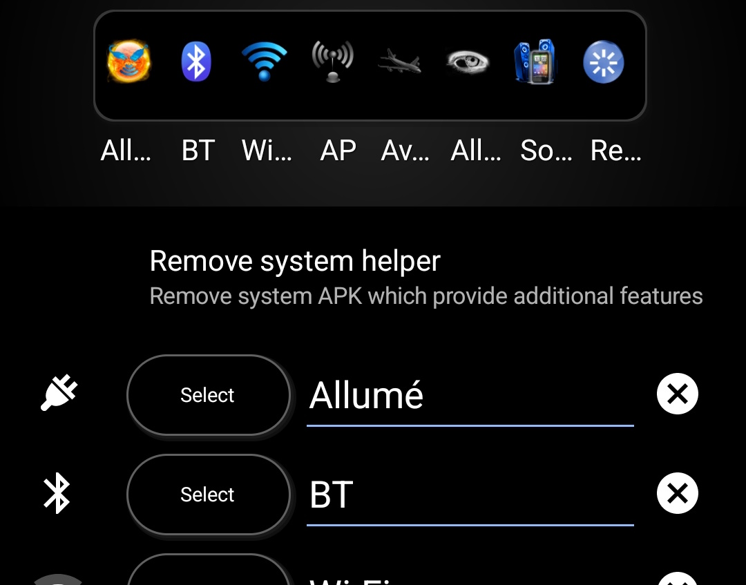
Toggle widgets can configure either 1 toggle or up-to ten depending on its size.
- Install/remove system helper (root required) allows you to install/remove a system apps that enables many extra toggles.
- Toggle #X, select the toggle, its label or reset it.
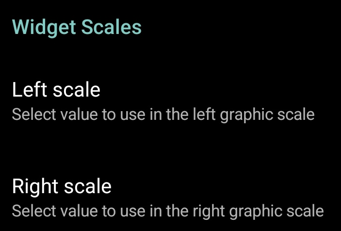
All text widgets can show left and right scales.