- Home
- 3C All-in-One Toolbox
- Getting started
- Online Help
- Settings
- 3C Sensitive Backups
- 3C Battery Watch
- 3C Companion App
- Other Apps
- Forums
- Icon packages
Time Estimates
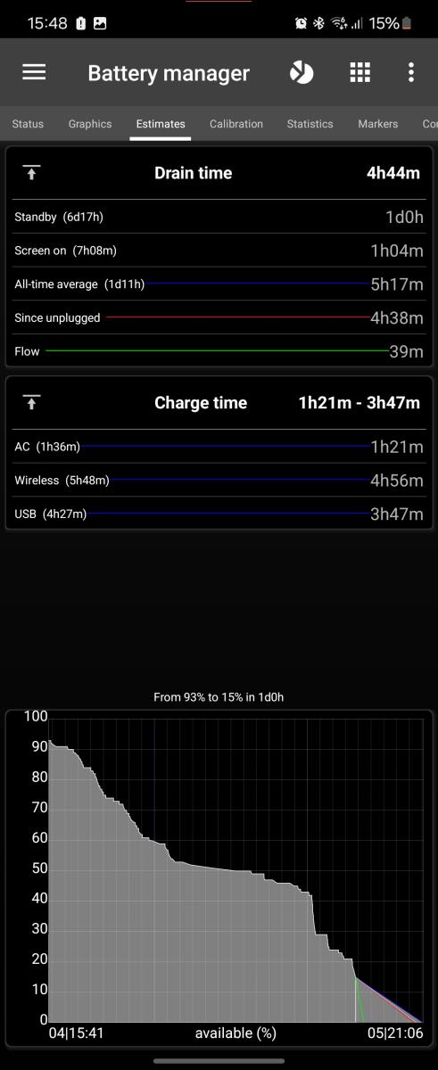 This screen, part of Battery Manager, shows estimated run-time based on learned usage pattern.
This require battery history to be recorded.
Tap on the remaining times to switch from remaining time (duration) and estimated time (precise date/time).
Tap on graphic to switch between average, since (un)plug and (dis)charge estimates.
Estimated Times
- Global estimates in blue is based on the average times below.
- Since last (un)plug in red is based on the average since (un)plugged using last measure below.
- Actual (dis)charge in green is based on mA charge or consumption.
- Standby shows how long device will last in standby (screen's turned off). Total time is in parenthesis (from 100% to 0%);
- Screen-on shows how long device will last while screen is turned on. Total time is in parenthesis (from 100% to 0%);
Graphic
This shows the last few hours and the 5 estimates produced.
Tap the graphic to switch the focus from on estimate to the other in loop.
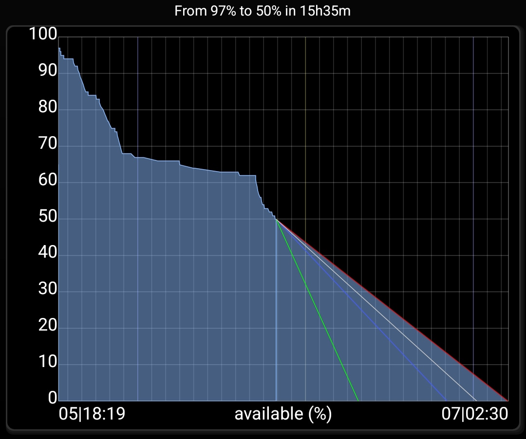
Widget (global estimates)
You can use the graphic estimates in a widget on your launcher! When selecting 'global estimates' in 'battery estimates' group, you will see 4 estimated line as follows:

Global shows a graph with multiple lines, green, blue, purple and red.
- Blue line is global average based on all historical data.
- Green line (or real-time) shows remaining time based on actual mA.
- Red (or current estimates) shows average since last (un)plug.
- Purple (or average estimates) is the pondered average between blue line and red line, eg the closer to 0% the closer the purple is to the red
How to extends battery life
For information on how to extend your battery life, here is an interesting Wiki (see battery life chapter).
To extend battery life, the important points are those 2:
- Keep battery cool, and avoid charging past 70% while using the device and creating over-heating.
- You can discharge your battery fully (voltage going down to 3200mV) it won't hurt as 3200mV actual means 40% of battery capacity is left, which is the safe threshold mentioned in the Wiki above!
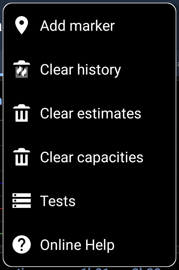
Additional options
In all screens additional options are available pressing the menu button in action bar:
- Add Marker
- Clear history
- Clear estimates
- Clear capacities
- Test (not available on all devices, may not be accessible on recent devices)
![]()